What Is a Crypto Liquidation Heatmap and How to Use It?
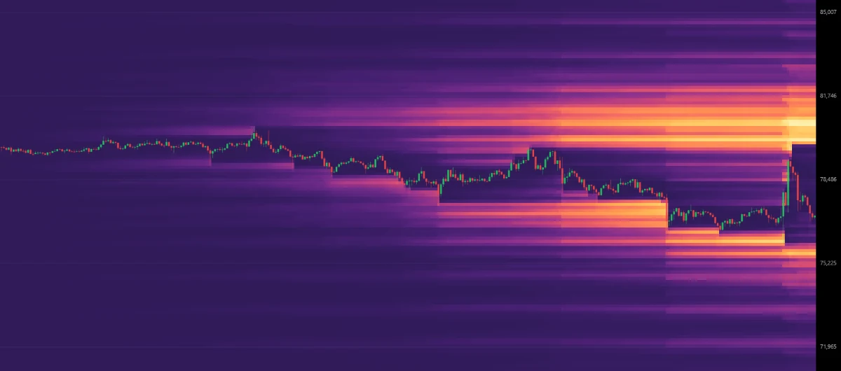
Every leveraged position in crypto carries a hidden tripwire: a price at which the exchange stops asking and closes the trade for you. On their own, those tripwires are invisible. Stacked together across thousands of traders, they form some of the most important levels on the chart, the places where forced buying and selling can turn an ordinary move into a violent one.
A liquidation heatmap makes those levels visible. This guide explains what a liquidation heatmap shows, how liquidations work in the first place, how to read the bands above and below price, and how to put a heatmap to work in your own trading with the free Trading Digits Liquidation Heatmap.
Key takeaways
- A crypto liquidation heatmap shows the price levels where leveraged futures positions are likely to be forcibly closed.
- Bands below the current price belong to leveraged longs; bands above it belong to leveraged shorts. The brighter the band, the more leverage sits there.
- Liquidations execute as market orders, so dense clusters can pull price toward them and extend a move once they are hit.
- Treat clusters as reference levels for take-profits and stop placement, not as standalone buy or sell signals.
- The heatmap is strongest alongside funding rates, long/short ratios and volume.
What is a crypto liquidation heatmap?
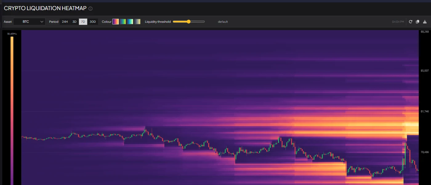
A crypto liquidation heatmap is a chart that shows where leveraged positions in the futures market are likely to be liquidated. Price runs along the vertical axis and time along the horizontal one. Colour intensity shows how much leverage is clustered at each price: dark areas hold little, while bright horizontal bands mark the levels where a large number of positions would be forced to close.
The name comes from the way it is read. Just as a thermal image shows where the heat is, a liquidation heatmap shows where the pressure is. It answers a question the price chart cannot: if price moves to this level, how much forced buying or selling is waiting there?
First, what is a liquidation?
Perpetual futures let traders open positions far larger than the money they deposit. A trader who puts up $10,000 and opens a $100,000 position is using 10x leverage. The deposit, called margin, is what absorbs losses.
Because the exchange has lent the rest, it cannot let losses exceed the margin. So every leveraged position has a liquidation price: the point at which the remaining margin falls to the minimum the exchange requires to keep the trade open. When price reaches it, the exchange's liquidation engine closes the position automatically.
A simple example: a 10x long opened at $100,000 loses its entire margin on a 10% drop. The exchange closes it a little before that point, somewhere just above $90,000, to cover fees and its own maintenance requirement. The same logic applies in reverse to shorts, which are liquidated when price rises.
Two consequences matter for everything that follows:
- Higher leverage means a closer liquidation price. At 10x, the liquidation price sits roughly 10% from entry. At 100x, it is about 1% away, close enough for ordinary volatility to trigger it.
- A liquidation is a forced market order. A liquidated long becomes a market sell; a liquidated short becomes a market buy. Nobody decides whether the price is good. The order simply executes.
Why liquidation levels cluster
If liquidation prices were scattered randomly, a heatmap would look like static. Instead, it shows distinct bands, because traders behave in predictable ways:
- They enter in the same places. Breakouts, range lows, round numbers and prior highs attract crowds of entries at similar prices.
- They use similar leverage. Leverage settings are not continuous. Most traders pick familiar values, so liquidation prices from the same entry area land at similar distances.
- Positions accumulate over time. While price ranges sideways, new positions keep opening at similar levels, and their liquidation prices stack up above and below the range.
The result is a chart where leverage concentrates into bands, and those bands are what traders watch.
How to read a liquidation heatmap
| What you see | What it means |
|---|---|
| A bright band below the price | Many leveraged longs would be liquidated if price falls to this level, adding a burst of selling |
| A bright band above the price | Many leveraged shorts would be liquidated if price rises to this level, adding a burst of buying |
| Dark or empty space | Little leverage at that price, so fewer forced orders and less fuel for a move |
| Bright bands close to price on both sides | Leverage is crowded around the current level, and a sharp move in either direction can be amplified |
| A band that has kept growing over several days | Leverage has been building at that level; the longer it builds, the more fuel it holds |
Two habits make the chart much easier to read. First, always locate the current price and look at the nearest significant band in each direction, since those are the levels in play right now. Second, judge bands against each other rather than in isolation: one band that is far brighter than everything around it matters more than several faint ones.
Why price is drawn to liquidation clusters
Liquidation clusters are often described as magnets, and the mechanics explain why.
When price reaches a dense band of long liquidations, those positions are closed with market sell orders. That selling pushes price lower, which can carry it into the next band of long liquidations, which triggers more selling. This chain reaction is a liquidation cascade, and it is why crypto moves so often travel further and faster than the news behind them would justify. A cascade through long positions is called a long squeeze; the same process through shorts, pushing price up, is a short squeeze.
There is also a liquidity argument. Large traders need a lot of opposing orders to fill big positions without moving the market against themselves. A cluster of liquidations is a guaranteed pool of market orders at a known price, which makes those levels attractive to anyone who needs size.
None of this makes a band a promise. Price can reverse well before reaching a cluster, and a band can be approached and rejected. Clusters describe where the fuel is stored, not whether anything will ignite it.
How to use the Trading Digits Liquidation Heatmap
The Trading Digits Liquidation Heatmap is free, needs no account, and covers Bitcoin, Ethereum and every other USDT-margined perpetual listed on Binance. Here is a practical routine.
- Pick an asset. Search for any perpetual in the asset selector. BTC is loaded by default, and the most actively traded markets appear first.
- Choose a period. Switch between 24H, 3D, 7D and 30D. Short periods show the leverage built around recent price action and suit intraday trading; longer periods reveal the larger clusters that have accumulated over weeks and matter more for swing trades.
- Find the nearest bright bands. Locate the current price, then the most significant band above and the most significant band below. Those are your immediate reference levels.
- Hover to read a level. Hovering over any cell shows its exact price, the amount of leverage sitting there in dollars, and the time in UTC. The scale on the left translates colour into dollar amounts.
- Tune the liquidity threshold. Slide it left to surface quieter clusters that are otherwise hard to see, or right to keep only the biggest walls. Double-click the slider to reset it.
- Change the colour scheme if it helps. Four palettes are available, and some make faint clusters easier to distinguish than others.
- Refresh, copy or download. A timestamp shows when the data was last updated, the refresh button pulls the latest data, and the copy and download buttons save the chart as an image for your notes or to share.
Practical strategies
1. Use clusters as take-profit targets
Because price tends to gravitate toward large clusters, a bright band in the direction of your trade is a natural place to take profit. If you are long and there is a dense band of short liquidations overhead, that band is a logical first target, and a cascade through it can extend the move further than expected. Scaling out as price approaches the band avoids giving back gains if it rejects instead.
2. Keep stops away from the obvious places
Stops placed just beyond a dense cluster are at risk: if price sweeps into the band, the forced orders can push it straight through your stop before reversing. Place stops where your trade idea is genuinely invalidated, account for the possibility of a sweep, and size the position so a stop-out is survivable. The Position Size Calculator makes that last step quick.
3. Watch for liquidity sweeps
A classic pattern is a fast wick into a large band followed by an equally fast recovery. The cluster gets cleared, the forced orders are absorbed, and with that fuel gone the move runs out of energy. Traders who wait for price to reclaim the level after a sweep, rather than chasing the move into it, often get a cleaner entry in the opposite direction.
4. Spot squeeze setups early
The heatmap is most revealing when it agrees with other positioning data. Heavy leverage on one side, combined with extreme funding rates and a lopsided long/short ratio, describes a crowded trade. Crowded trades do not reverse on schedule, but when they do, the heatmap shows how far the squeeze could run.
5. Compare periods
A level that stands out on both the 24H and the 30D view carries more weight than one that appears on only one of them. Checking the short and long periods side by side separates fresh, fragile clusters from ones that have been building for weeks.
6. Confirm with volume
A move into a cluster on rising volume has more conviction behind it and is more likely to cascade through. A drift into a band on thin volume is more likely to stall. The Crypto Volume Screener shows when participation is unusually high.
A worked example
Here is how the pieces fit together, using round, hypothetical numbers.
Suppose Bitcoin trades at $100,000 after several days of sideways movement. The 7D heatmap shows a bright band of long liquidations at $97,500 and a larger band of short liquidations at $104,000. Funding rates are positive and elevated, and the long/short ratio shows most accounts positioned long.
The read: leverage is crowded on the long side, and the nearest large pool of forced orders sits below the price. A drop toward $97,500 could cascade as those longs are liquidated. A trader holding a long might tighten risk or take partial profit, while a trader looking to buy might wait to see whether the $97,500 band gets swept and reclaimed rather than buying ahead of it.
If price does wick through $97,500 and quickly recovers, the picture changes. The crowded longs have been flushed, funding tends to cool, and the large band of short liquidations at $104,000 becomes the obvious magnet overhead.
None of this is a prediction. It is a way of organising the scenarios, knowing where the fuel is before the move starts rather than after.
Common mistakes
- Treating every band as a guaranteed target. Clusters attract price; they do not command it. Plan for the scenario where price turns before reaching a band.
- Forgetting which period you are viewing. A dominant band on the 24H view can be a minor feature on the 30D view. Always know the timeframe behind the level.
- Chasing a move into a cluster. By the time a cascade is visible, most of it has often already happened. Entering late means buying or selling at the worst price.
- Using the heatmap alone. It shows where leverage sits, not market direction or trend. Pair it with structure, momentum and positioning data.
- Over-leveraging yourself. Every bright band on the chart is made of traders who used more leverage than the market allowed. The easiest way to use a liquidation heatmap well is to stay off it.
Frequently asked questions
What is a liquidation heatmap in crypto? It is a chart that shows the price levels where leveraged positions in crypto futures are likely to be forcibly closed. Price runs vertically, time horizontally, and brighter colours mark levels where more leverage is clustered.
How do you read a liquidation heatmap? Find the current price, then look at the brightest bands above and below it. Bands below are long liquidation levels, which are hit if price falls; bands above are short liquidation levels, which are hit if price rises. The brighter a band, the more leverage sits at that price.
Why does price move toward liquidation levels? Liquidations execute as market orders. When price reaches a dense cluster, the forced orders push it further in the same direction and can trigger the next cluster. Large clusters also offer the liquidity big traders need to fill size, which makes them natural targets.
What is the difference between a long squeeze and a short squeeze? A long squeeze is a cascade of long liquidations that drives price down, as each forced sell pushes price into the next cluster of long positions. A short squeeze is the same process in reverse: liquidated shorts become forced buys that drive price up.
Which period is best on a liquidation heatmap? It depends on your holding period. The 24H view suits intraday trading because it focuses on leverage built around recent price action. The 7D and 30D views suit swing trading because they show the larger clusters that have accumulated over weeks. Levels that appear on several periods deserve the most attention.
Does the heatmap work for altcoins as well as Bitcoin? Yes. The Trading Digits Liquidation Heatmap covers Bitcoin, Ethereum and every other USDT-margined perpetual listed on Binance. Clusters on smaller altcoins tend to matter even more, because thinner order books mean forced orders move price further.
Is a liquidation heatmap a trading signal? Not on its own. It shows where leverage is concentrated, which makes it an excellent source of reference levels for targets and stops, but it does not say which direction price will take. It works best combined with funding rates, long/short ratios and volume.
Conclusion
Leverage is one of the defining features of crypto markets, and liquidations are where its consequences show up on the chart. A liquidation heatmap turns that hidden structure into something you can plan around: where forced orders are waiting, which side of the market is crowded, and how far a move could run once it starts.
Use it to find reference levels, respect the magnet effect without treating it as a guarantee, and always read it alongside other positioning data. Open the Liquidation Heatmap to see the current clusters, then pair it with Funding Rates, the Funding Rate Heatmap, Longs vs Shorts and the Volume Screener for a complete picture of derivatives positioning. If you are building a broader toolkit, our guide to the RSI heatmap covers the momentum side of the market.
This article is for educational purposes only and is not financial advice. Trading with leverage carries a high risk of loss, including the loss of your entire margin.